We were asked to design a advert that would be placed in Creative Review, the size and shape of this piece of design depends on how much we wanted to spend on it.
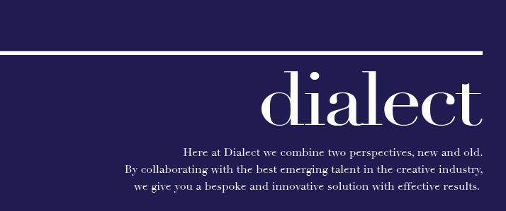
Having looked through many Creative Review magazines we decided that it was the bright and large adverts that stood out; full page adverts with a single dominant colour (e.g. yellow). These adverts were very simple and only had the information about the company name, and the contact details. On this basis we decided to keep our advert simple and use a block colour. We experimented with a variety of colours to see which one was best suited for the task and chose to use the Dark Blue as it gave a more sophisticaed feel to the advert.


No comments:
Post a Comment